The Objective
The illustration was designed to reflect the convention’s superhero theme while adhering to specific creative and legal constraints. To stay within budget, the color palette was intentionally limited. The logo needed to be versatile enough for use across multiple applications—including online platforms, apparel, collectible pins, and a round, flat hockey puck–style PEZ dispenser head. Due to licensing restrictions, the illustration could not feature any copyrighted superhero characters or display the PEZ logo.
The Solution
As a PEZ collector, I was able to draw inspiration directly from my own collection for reference. While illustrating a generic PEZ Boy dispenser—complete with visible candy and shown soaring through the air—I carefully considered how the actual dispenser mechanism functions. To stay within the superhero theme, I added a cape to enhance the dynamic, playful feel. I also selected complementary typography that loosely echoes the official PEZ branding, while remaining within legal and creative guidelines.
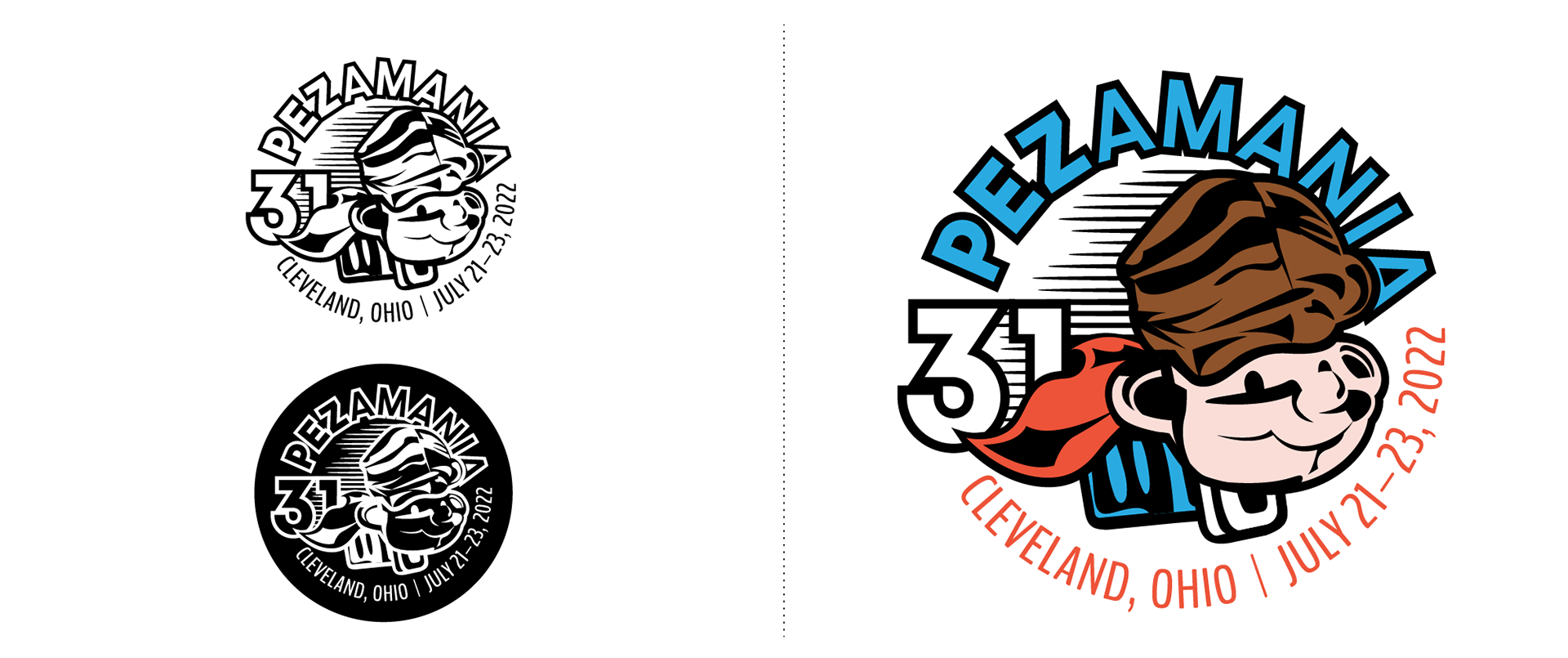
The logo is all it's forms for printing on various PEZamania apparel and items provided to the PEZamania PEZ Dealers.
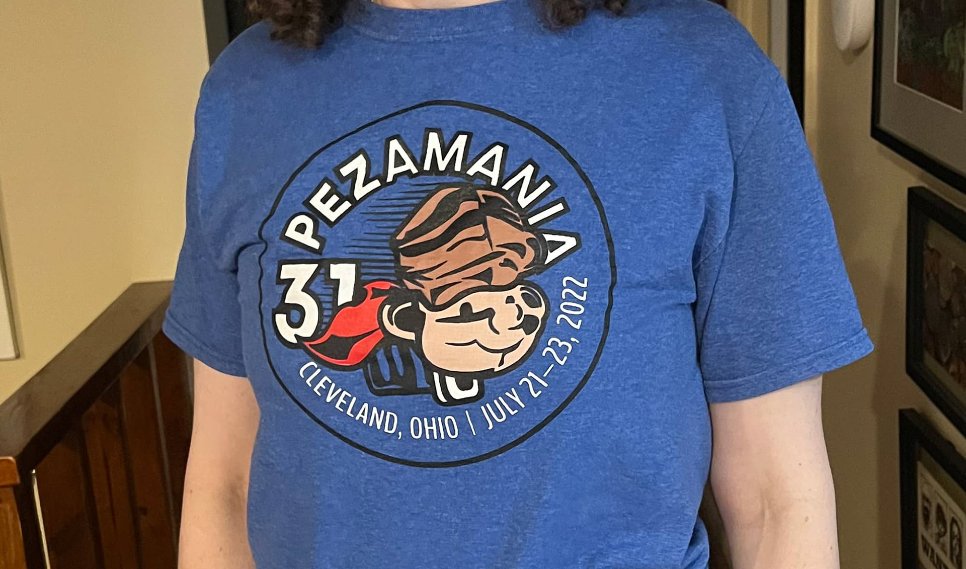
The branding as it appears on the convention t-shirt.